Buttons
Pill-shaped, intentional, and always earning their spot. Four types — Primary, Secondary, Tertiary, Text Link — with one rule: one primary per screen.
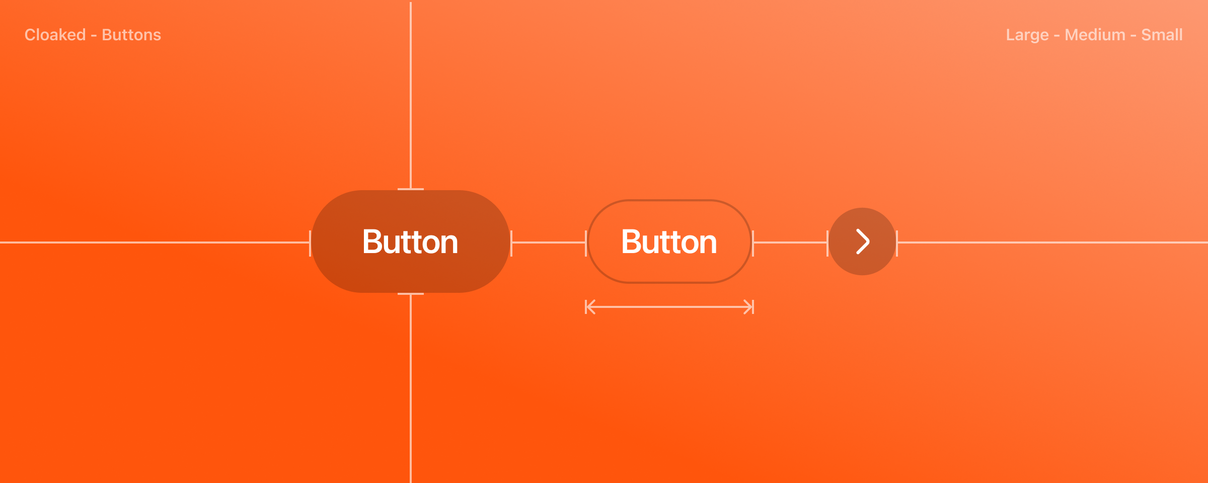
Playground
Toggle any combination of type, state, size, and icon. Changes update the live specimen and the copy-ready snippet.
Action
Height
48 · largeRadius
9999px · full pillType
SF Pro ·
600 · 16/21Pressed
3px inset ring
Usage
Use buttons to let people take an action — submit a form, confirm a choice, or move to the next step. Reserve primary for the single most important action on the screen.
Types
Four button types, each with a clear role in the visual hierarchy.
Primary · Brand/300 Cloaked
One per screen. The single most important action.
Secondary · Ink
Supporting action paired with a primary.
Tertiary · Ghost
Low-emphasis actions — cancels, dismissals.
Text Link · Inline
Minimum emphasis. Sits inside flowing text.
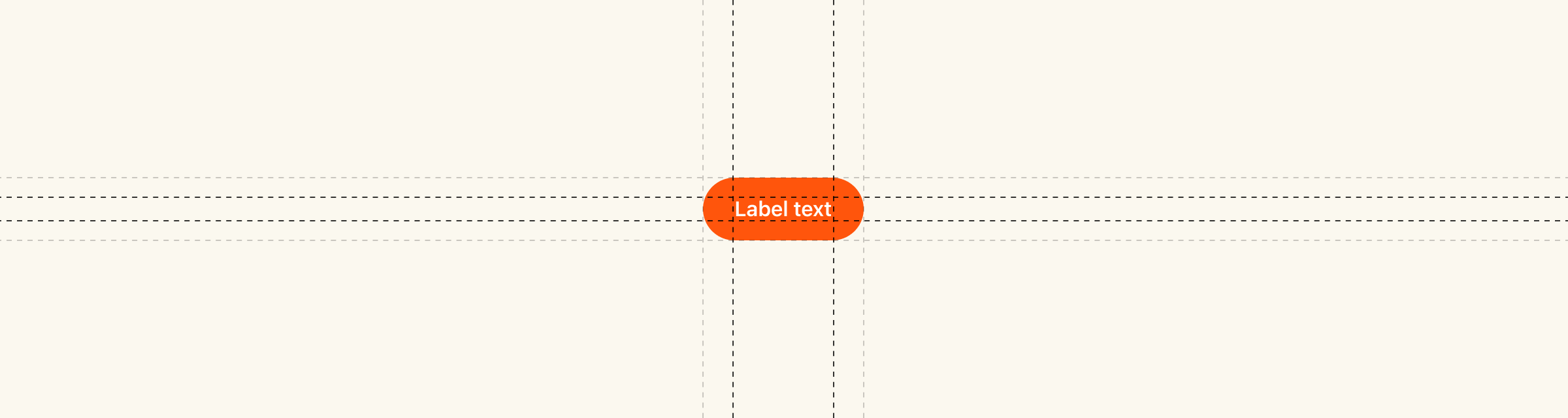
Anatomy
A button is a container, a label, and — optionally — an icon. The pill shape is non-negotiable.
1Container
Pill-shaped, 9999px radius. Holds the label and any icons.
2Label
SF Pro Semibold. Sentence case. Verb-first when possible.
3Leading icon
Optional, 18×18. Reinforces the action's meaning.
4Trailing icon
Optional. Signals direction or chevron disclosure.
CLOSE-UPLabeled button zoom
States
Every button has four interactive states. Hover and pressed have visible feedback; inactive is clearly non-interactive.
Primary · Brand/300 Cloaked
Default
Hover
Pressed
Inactive
Secondary · Ink
Default
Hover
Pressed
Inactive
Tertiary · Ghost
Default
Hover
Pressed
Inactive
Text Link · SF Pro inline
Default
Hover
Pressed
Inactive
Sizes
Three sizes — pick by context density, not by importance. Importance is already encoded in the type.
Dimensions
Heights, paddings, and gap values for every size.
| Height (L) | 48px |
|---|---|
| Height (M) | 40px |
| Height (S) | 32px |
| Horizontal padding (L) | 24px |
| Horizontal padding (M) | 16px |
| Horizontal padding (S) | 16px |
| Gap (L) | 8px (icon ↔ label) |
| Gap (M / S) | 4px |
| Radius | 9999px (full pill) |
| Border | 1px when outlined |
| Icon size | 18 × 18px, stroke 2px |
Typography
SF Pro Display Semibold across all sizes. Tracking tightens as size grows.
| Family | SF Pro Display |
|---|---|
| Weight | 600 (Semibold) |
| Large · Size / line | 16 / 21 |
| Large · Tracking | -0.20px |
| Medium · Size / line | 16 / 21 |
| Medium · Tracking | -0.20px |
| Small · Size / line | 13 / 18 |
| Small · Tracking | -0.05px |
| Case | Sentence case |
Color styles
Token-level color mapping for each type × state combination.
Primary · Brand/300 Cloaked
| Default · bg | #FF550C · --brand-300-cloaked |
|---|---|
| Default · text | #FFFFFF |
| Hover · bg | #CC3D00 · --brand-400 |
| Pressed | bg #CC3D00 + inset 0 0 0 3px #FFF ring |
| Inactive · bg | #FFDBCC · --brand-200 |
| Inactive · text | rgba(255, 255, 255, 0.7) |
Secondary · Ink
| Default · bg | #000000 · --ink |
|---|---|
| Hover · bg | #262626 · --ink-hover |
| Pressed | bg #262626 + 3px inset white ring |
| Inactive · bg | #D9D9D9 · --gray-200 |
Tertiary · Ghost
| Default · bg | transparent |
|---|---|
| Hover · bg | #F2F2F2 · --gray-50 |
| Pressed · bg | #D9D9D9 · --gray-200 |
| Outlined border | #D9D9D9 |
| Inactive · text | #A6A6A6 · --gray-400 |
Destructive
| Default · bg | #EC4545 · --status-negative |
|---|---|
| Hover · bg | #C53535 · --red-300 |
| Inactive · bg | #FAD2D2 |
Spacing
Minimum breathing room around buttons — respect these to avoid accidental adjacency.
| Min gap between buttons | 12px |
|---|---|
| Margin from container edge | 16px minimum |
| Stacked (vertical) gap | 12px |
| Full-width button height | 48px (Large) |
Motion
All state transitions use the same ease and duration for consistency.
| Duration | 120ms |
|---|---|
| Easing | var(--ease-out) |
| Animated properties | background-color, box-shadow, color, border-color |
| Pressed ring | Appears instantly on pointer-down; no fade |
Visual hierarchy
One primary per screen. When you feel tempted to add a second, you need to rethink the screen — not the button.
Do
Pair one primary with a tertiary for the "cancel" side. The primary clearly wins the eye.
Don't
Two primaries side-by-side. The eye has no anchor — users hesitate or guess.
Icons should communicate clearly
A single recognizable glyph per button sharpens intent — a sparkle for generation, pause for protection, copy for identity values. Never stack an icon over a label and never ship two icons in one button.
New identity
jayden.hale
EMAILj.hale.7t@cloaked.app
NUMBER+1 (512) 555-0134
Do
Pair "Generate identity" with a single sparkle icon — clear, branded, and scannable.
Call Guard
Protection is on
Unknown callers are screened with Cloaked live voicemail.
Don't
Don't vertically stack the icon and "Pause protection" — the button loses its horizontal rhythm.
Unknown caller
512-555-0198 · 12s
▶
Spam likely
415-555-0117 · 47s
Download
Don't
Don't pair two icons inside one row — "↓ Download ✕" reads as conflicting intent.
Keep the icon and label grouped
As a Cloaked button grows or shrinks between contexts — a form sheet, a list row, a sidebar — the icon and label stay together, centered as a single unit.
Do
Keep the icon and "Send code" grouped and centered, even as the container widens.
Don't
Don't anchor the icon and label to opposite sides — the button stops reading as a unit.
Icon placement
The icon sits on the leading side of the label — where the eye enters the button. In left-to-right surfaces that's the left; in right-to-left surfaces it flips to the right so the reading order is preserved.
Do
LTR — the copy glyph leads "Copy number".
Do
RTL — the glyph flips to the trailing side so the label still reads first.
Constrain button width
Buttons can change size and scaling behavior across different window sizes. On wide marketing surfaces, the primary CTA can stretch so wide it stops reading as a button — it looks like an empty banner. Constrain the width or pair it with other elements so the Cloaked pill shape stays visible.
cloaked
IdentitiesNumbersEmailsScan
Log in
Create identities that are impossible to trace
One email, one number, one card — per service, per moment.
Get Cloaked
Don't
Don't let a CTA like "Get Cloaked" stretch to the full hero width — the result looks flat and ignores the brand's compact pill shape.
Container width should fit the label
The button sizes itself to the label it carries. On an identity card, "Copy email" should hug its text; it can stretch to match a layout; but it must never be narrower than the word it holds.
identity
rowan.shaw
r.shaw@cloaked.app
Used on 3 services
Do
"Copy email" sized to its label — compact, legible, right-proportioned for the identity card.
identity
rowan.shaw
r.shaw@cloaked.app
Used on 3 services
Do
Or stretch to fill the card width — still legible, still balanced with the overflow icon.
identity
rowan.shaw
r.shaw@cloaked.app
Used on 3 services
Don't
Don't squeeze the button narrower than its label — "Copy em…" betrays the Cloaked polish.
Keep toggled label lengths consistent
Call Guard's Pause / Resume control toggles between two states. Keep the labels within a few characters of each other so the layout doesn't jump and the user's eye stays on the action.
Do
"Pause" and "Resume" are the same length — the toggle stays visually anchored.
Don't
Don't swap "Pause" for "Resume protection for 30 min" — the button jumps size and the surrounding UI has to reflow.
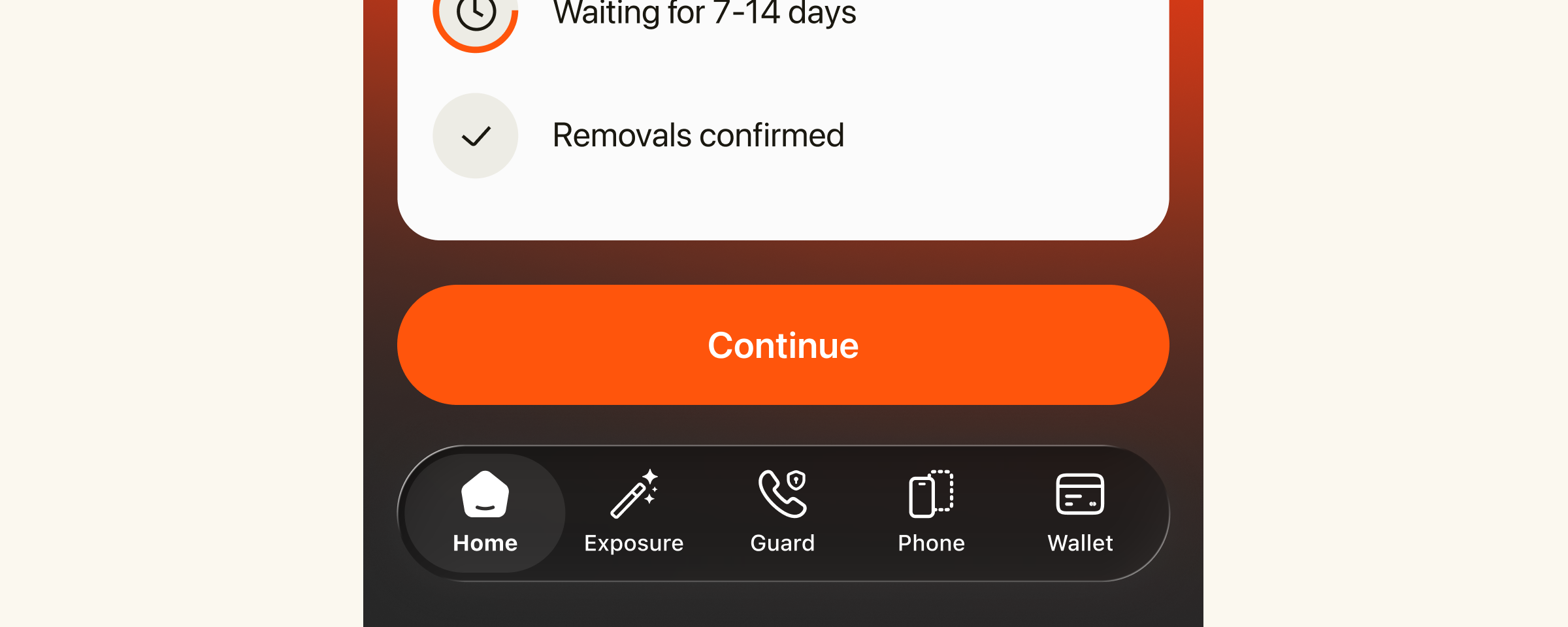
Use buttons sparingly
On Cloaked surfaces a button carries weight — it commits the user to generating an identity, confirming an upgrade, or pausing protection. Reserve buttons for those moments. Secondary actions can live as text links, chips, or icon buttons so the primary action stays unmistakable.
PRO
Cloaked Pro upgrade
PlanAnnual
Unlimited identitiesIncluded
Data removalIncluded
Total$10 / mo
Do
One decision, one button. "Confirm upgrade" is the only primary action on the Pro upgrade summary.
PRO
Cloaked Pro upgrade
PlanAnnual
Unlimited identitiesIncluded
Data removalIncluded
Total$10 / mo
Don't
Don't dilute the moment with five competing buttons — move secondary actions into links or an overflow menu.
Never wrap label text
Label text should always be fully visible on a single line. If the label feels long for the container, shorten the label — don't wrap it.
14 data brokers are exposing your info
We found your name, email, and address on multiple public sites. Cloaked can request removal.
Do
"View all findings" fits on one line — sentence case, proper Cloaked voice.
14 data brokers are exposing your info
We found your name, email, and address on multiple public sites. Cloaked can request removal.
Don't
Don't wrap label text — even when the container is tight, keep the label on a single line or shorten it.
Layout & alignment
Primary goes on the right in western reading contexts. Stacking is acceptable on narrow screens; keep the primary on top.
Do
Primary on the right (LTR), secondary or tertiary on the left. Reads as the natural endpoint of the row.
Do
On narrow screens, stack vertically with the primary on top so the eye lands on the recommended action first.
Accessibility
Buttons must be operable by keyboard and understandable to assistive tech. These aren't optional.
| Target size | Minimum 44 × 44px hit area (touch). Achieved by Large and Medium; Small needs surrounding padding. |
|---|---|
| Focus visible | 2px --focus-ring offset outline on keyboard focus |
| Icon-only buttons | Require aria-label describing the action |
| Loading states | Set aria-busy="true"; keep the label visible |
| Contrast — Primary | White on #FF550C = 4.51:1 · passes AA for large text |
| Contrast — Secondary | White on #000 = 21:1 · AAA |
| Contrast — Inactive | Informs users the action is unavailable via color + cursor |
HTML
Every Cloaked button is a <button> element with a type class. No wrappers, no divs.
<button class="btn btn-primary">
  Continue
</button>

<!-- Medium, secondary -->
<button class="btn btn-secondary md">
  Confirm
</button>

<!-- Outlined tertiary, small -->
<button class="btn btn-tertiary outlined sm">
  Learn more
</button>

<!-- Destructive primary -->
<button class="btn btn-primary destructive">
  Delete identity
</button>
Modifiers
Stack these classes on top of the base type.
.md | Medium size (40px tall) |
|---|---|
.sm | Small size (32px tall) |
.outlined | Stroke instead of fill (not supported on Text Link) |
.destructive | Remaps primary colors to danger tokens |
.s-hover | Forces hover state (for docs / specs only) |
.s-pressed | Forces pressed state |
.s-inactive | Visually inactive (pair with disabled) |
React
The <Button> component wraps the CSS classes and accepts type, size, and icon props.
import { Button } from '@cloaked/ui';

<Button type="primary" onClick={handleStart}>
  Start protection
</Button>

<Button
  type="secondary"
  size="md"
  leadingIcon={<PlusIcon />}
>
  Add identity
</Button>

<Button type="primary" destructive>
  Delete identity
</Button>
Props
type | 'primary' | 'secondary' | 'tertiary' | 'text' · default 'primary' |
|---|---|
size | 'lg' | 'md' | 'sm' · default 'lg' |
outlined | boolean · default false |
destructive | boolean · default false |
leadingIcon | ReactNode · optional |
trailingIcon | ReactNode · optional |
iconOnly | boolean · requires aria-label |
loading | boolean · replaces icon with spinner, sets aria-busy |
disabled | boolean · applies inactive state + native disabled attr |